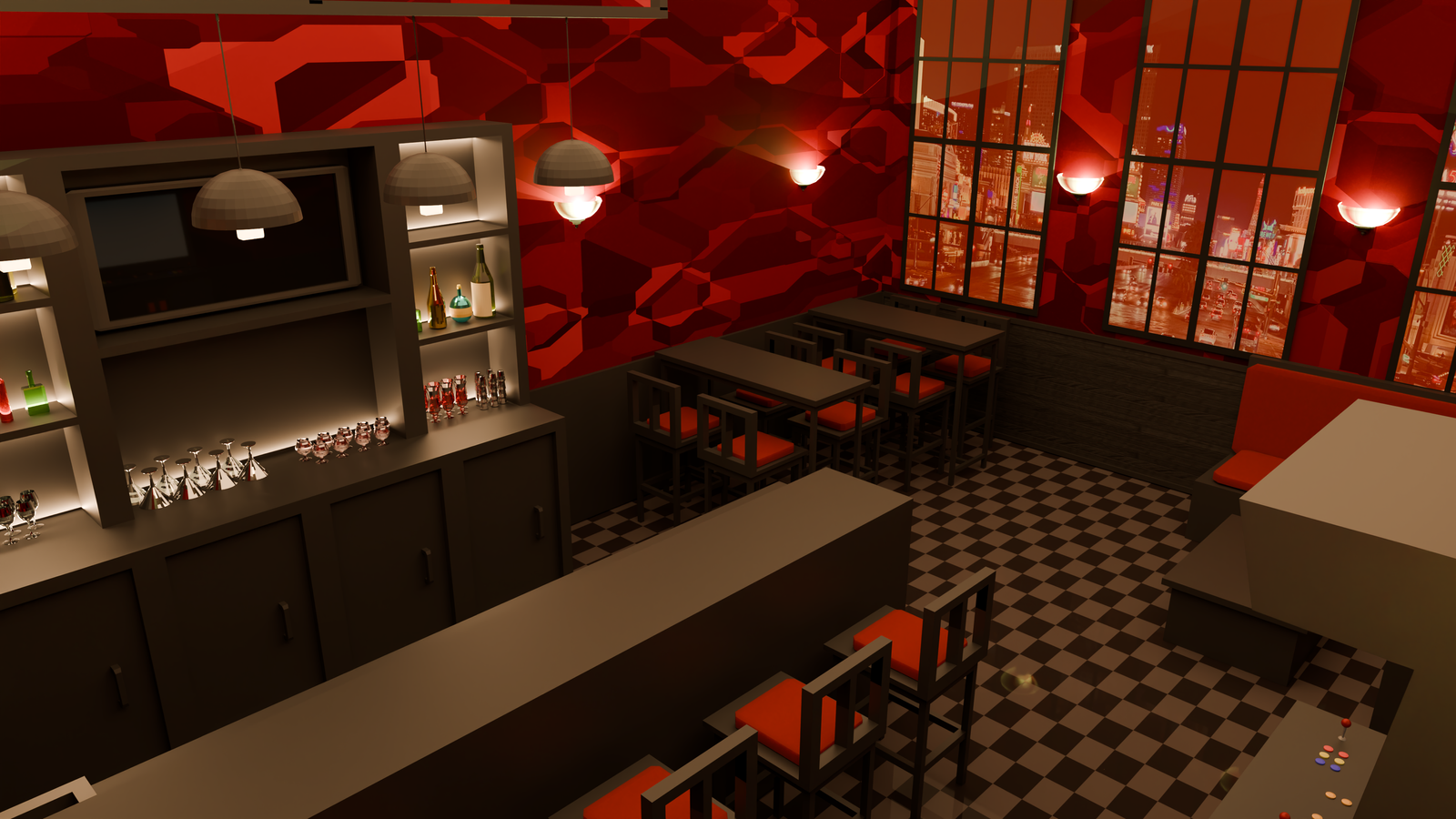
Introducing a key setting of a project I'm working on: a Las Vegas speakeasy called "The Midnight Oil."
An upscale but discreet night bar inspired by the establishments I visited on my trip to Vegas last year.
"The Midnight Oil" features a bizarre collection of Vegas mob paraphernalia and allusions to vampire fiction.
Perhaps an even older family than the Midwest Mafia has made its way to the Strip.
For this setting, I settled on a primarily black and red color scheme.
The architecture and furniture was meant to evoke feelings of the new and the old,
blending elements of old English pubs and trendier industrial-style bars. And of course,
there's a random arcade cabinet that patrons barely know how to play. I intend for the
cabinet to eventually have custom textures that feature graphics from the game, a
legally-distinct Darkstalkers fighting game clone that fits with the establishment's
vampire theme. The windows have also been tinted a sanguine red, in theory to block
out the sun's rays.
“The Midnight Oil” is one of many settings in a story I've been working on for the past year
in my free time about the nightly afterlife of Las Vegas. I wanted to experiment with using
Blender to create basic renders of environments to reference for the story, especially for
drawing trickier perspectives. It was either learn Blender basics or build sets in The Sims 4,
but Blender is free and The Sims 4 has an ungodly amount of paid DLC to have access to all of the
decorative options.
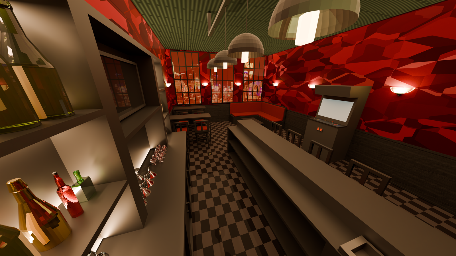
Rendering Process
Posted 10/19/2025
Being new to Blender meant that there was plenty of trial and error
while praying that every asset is modeled in-proportion with one another. This meant there
were plenty of things that worked one day and then broke the next, especially after software
updates. The assets and the room itself were made in separate files and appended afterwards.
This allowed me set better reference points between objects (ex: making sure the stools fit under the high tops)
as well as create copies with the same material properties for objects that I knew would
need to be repeated.
I also had a spreadsheet for all the assets I would need for
this project and listed them by priority. This made sure that I knew what the most important
models would get done first while others could be set for later deadlines. I hope to
streamline this process in the future, especially as the number of sets grows. For example,
an environment that only shows up for a few panels in the comic probably won't need to be
fully textured and decorated for people to be able to distinguish what it is.
The most difficult assets to get working in the full render was
definitely anything with a reflective texture. While the bottles and TV screens worked fine
on basic models, the glassware needed to be hollowed out in a specific way for the glass texture
to look right. I think the effort was worth it in the end since they make up more than half of
the total assets in the scene. Unfortunately, the ray-traced reflections on the glass increase
the time it takes to render each shot exponentially.
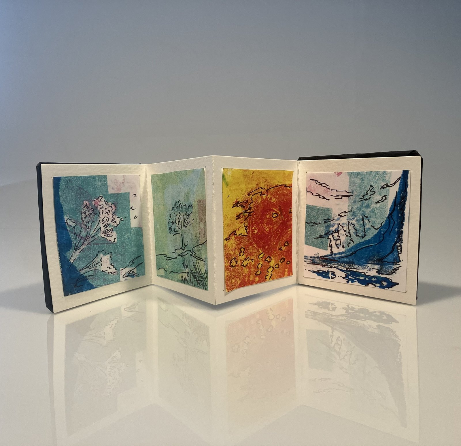
Gelli-Block Print - "Time"
Posted 04/30/2025
This accordion book was made with gelli block printmaking using ink imprints
from textured objects. After the prints were dried, contour lines were drawn along the texture to
bring out different shapes. The project itself was for last semester's Drawing I class in
collaboration with a featured visiting artist.
I also had a spreadsheet for all the assets I would need for
this project and listed them by priority. This made sure that I knew what the most important
models would get done first while others could be set for later deadlines. I hope to
streamline this process in the future, especially as the number of sets grows. For example,
an environment that only shows up for a few panels in the comic probably won't need to be
fully textured and decorated for people to be able to distinguish what it is.
The delay between print creation and the contour drawing made it
difficult to create a coherent composition. For most of the prints (many unused for this
accordion book), it was a lot of experimentation and not fully knowing what it was going
to look like when it was done. Many of the ink colors blended during the drying process
in an unappealing or unexpected way, limiting my final options. I ended up finding a lot
of tree-like patterns in the prints I stuck with and eventually settled on a nature theme.
Maybe it was a cop-out to frame a bunch of dissimilar color schemes as the four seasons,
but I wasn't practicing mindfulness that day.
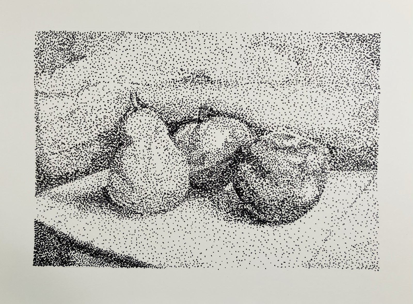
Stipple Drawing
Posted 04/16/2025
This was a still life drawing made using a stippling method. It was created as a class exercise
on how density and value can create form in art in the absence of line. There isn't really much left to add onto this
and I'm running out of steam while my code keeps breaking. I'm just going to use filler text for the rest of this post.
Lorem ipsum dolor sit amet, consectetur adipiscing elit, sed do eiusmod tempor
incididunt ut labore et dolore magna aliqua. Ut enim ad minim veniam, quis nostrud exercitation ullamco
laboris nisi ut aliquip ex ea commodo consequat. Duis aute irure dolor in reprehenderit in voluptate velit
esse cillum dolore eu fugiat nulla pariatur. Excepteur sint occaecat cupidatat non proident, sunt in culpa
qui officia deserunt mollit anim id est laborum.
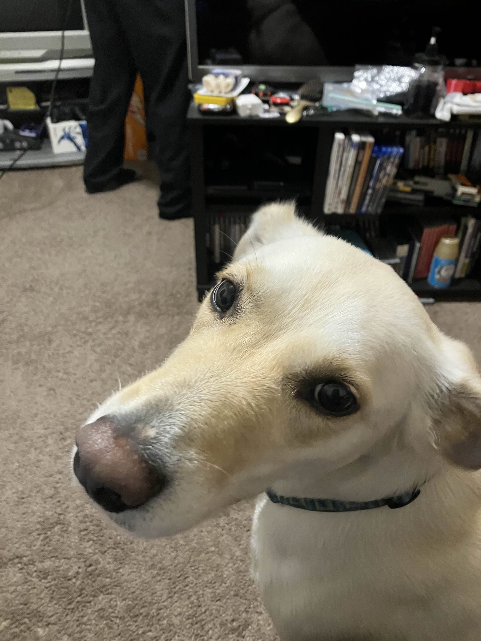
Anyway, here's a random dog that was staying in my boyfriend's apartment for a few weeks.
His roommate adopted this dog right as my partner and his brother moved in with him and proceeded to never be
around to take care of her. He was around so little that neither my partner nor I ever learned her name. My
partner's roommate found a better home for her after she started ripping things up while everyone was away.
Emily Gallagher
I'm a graphic design student in Bangor, Maine and this is my portfolio/personal blog.